
Last 26th of May European elections took place. In Belgium, people also voted for the 150 deputies who are part of the Chamber of Representatives as part of the federal elections. The following day, newspapers, webpages and television news were flooded with graphs showing the results. But are these graphs effective in transmitting the key messages?
How the press reported the results
Let’s take an example. The graph below is extracted from the Belgian newspaper Le Soir and it is similar to the ones that La Libre Belgique and L’Echo reported. It shows the distribution of seats in the parliament, comparing the results between 2014 and 2019.
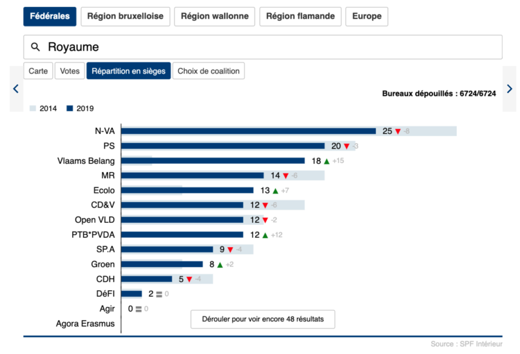
We believe that this is an ineffective way of reporting and contrasting election results for several reasons. The main problem is the difficulty to get the main messages after a first glance. The results of 2014 are shown in a light blue bar which does not work well when there has been an increase in votes. To get the numbers of 2014 we need to look at the number of seats in 2019 and reduce (if we get a green arrow facing upwards) or increase (if the arrow is red and downwards) the grey number.
In this bar chart it is almost impossible to appreciate (unless we look at it for a while) that the far-left PTB*PVDA party had 0 representatives in 2014 but 12 in 2019. Or that the extremists Vlaams Belang increased from 3 seats in 2014 to 18 seats in 2019. The green parties (Ecolo and Green) are separated by several bars, so we can’t directly appreciate that there’s been a green wave. In essence, bar charts like this one require quite a lot of time to understand and draw conclusions
What would be an effective alternative?
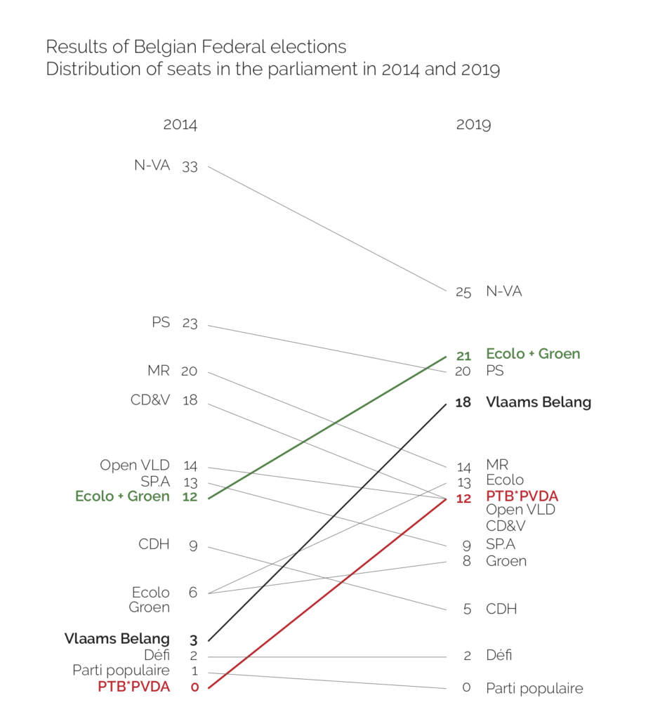
We’ve re-worked the graph of Le Soir into what Edward Tufte calls a table-graphic. The chart, when read vertically, ranks the 13 parties by number of seats in the parliament in 2014 and 2019. The names of the parties are spaced in proportion to the number of seats. Across the two columns, the paired comparisons show how the numbers have changed over the two election years. The slopes are also compared by reading down the collection of lines, and lines of unusual slope stand out from the overall downward pattern.
In this re-worked graph, the messages clearly stand out (as opposed to the bar chart):
- All parties, except four, have lost seats in the parliament.
- N-VA has lost its privileged position, going down from 33 to 25 seats.
- The far-left PTB*PVDA, which had no representation in 2014, has entered the parliament in 2019 with a total of 12 seats.
- The support to the Greens (Ecolo and Groen) has raised from 12 to 21 seats.
- The right extremists Vlaams Belang have also substantially increased: from 3 seats in 2014 to 18 in 2019.
Interested in data visualisation?
If you’d like to know more about how to get the most out of your data and produce graphs that effectively visualise your messages join our training: Figures of evidence: uncover the real value of your data by making effective graphs. We are offering an independently organised version of this training on the 28th of June in Brussels, register here, there are still places available!