
BP launched on the 11th of June their 2019 Statistical Energy Review. The data published every year as part of this review is very valuable for anyone working in the energy sector, with detailed information about world energy consumption (and production), CO2 emissions by source, per geographical area, per country, etc. Along with this information, BP releases a report, where the data is visualised through different graphical displays. Looking at the 2018 edition, we have seen that they use a very typical graph to report energy trends: the stacked area display, which is also used by other very well known institutions like the International Energy Agency (IEA). Nevertheless, staked area graphs –actually stacked graphs in general– are quite ineffective. Let’s explore why.
We will discuss the particular graph below, which shows the World energy consumption by source, from 1992 until 2017. Each source is represented by an area, and each are is stacked one on top of each other until reaching the total consumption.
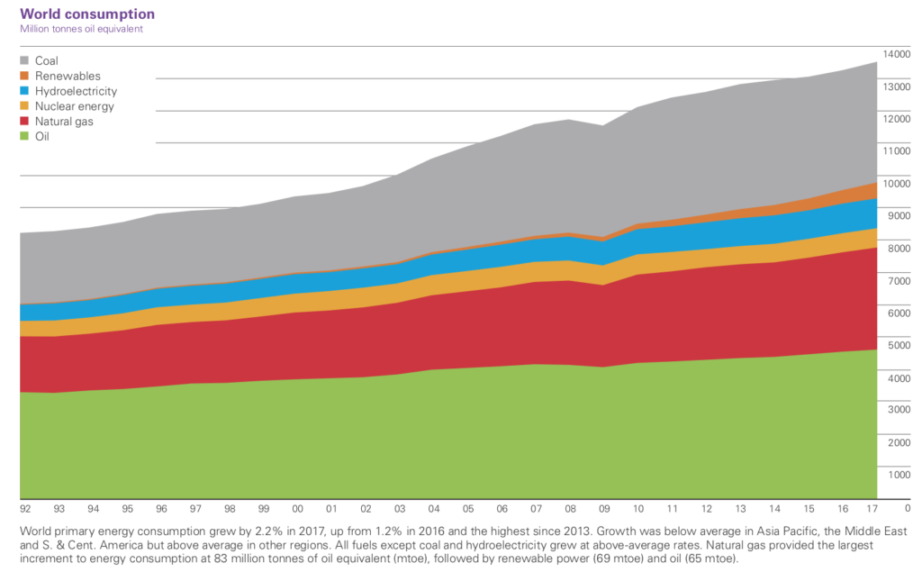
What are the main problems of such a graph? Namely:
- A colourblind person will not be able to read it.
- It’s very complicated to ‘isolate’ the evolution of one particular energy source.
- Specific events for a certain energy source cannot be distinguished.
The colours and design are not suited for a colourblind person
The display uses a legend to identify the energy sources, which forces reading the graph in two steps. Furthermore, the chosen palette of colours is unfortunate for a colourblind person. Here’s how a protanope (red-color blind) would see it:
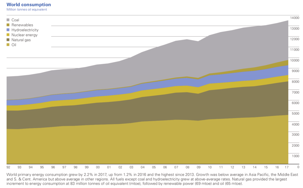
Oil (originally in green), nuclear (originally in orange) and renewables (originally in light orange) cannot be well distinguished by a person with colour deficiency. As we discussed in this post, colourblindness is much more common than we thing. By using legends and not paying attention to the selected colours, BP’s graph is unreadable for a great part of the population.
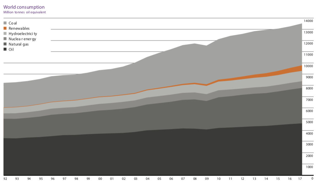
The evolution of a specific energy source can’t be easily isolated
Would you be able to say whether nuclear consumption changed in the last years or whether it remain constant? What about hydroelectricity, how much did it increase? How does coal consumption relate to oil consumption? Answering to these questions is quite tricky with a stacked area graph.
We can’t figure out how specific events affected a particular energy source
Let’s take the example of renewables, which come after oil, natural gas, nuclear and hydroelectricity in the stacking. It is obvious that the financial crisis in 2009 influenced energy consumption, but how were renewables in particular affected? Were they actually affected at all? It is impossible to figure this out in the stacked area graph.
What would be an alternative to such a graph?
It all comes down to the message that we want to communicate. Ideally, the caption of a figure should give us a hint. Let’s look at what BP writes in their report:
World primary energy consumption grew by 2.2% in 2017, up from 1.2% in 2016 and the highest since 2013. Growth was below average in Asia Pacific, the Middle East and S. & Cent. America but above average in other regions. All fuels except coal and hydroelectricity grew at above-average rates. Natural gas provided the largest increment to energy consumption at 83 million tonnes of oil equivalent (mtoe), followed by renewable power (69 mtoe) and oil (65 mtoe).
None of these messages can be actually withdrawn from the graph… As an alternative to the stacked area graph, we have produced the displays below in order to unveil the real value of the data.
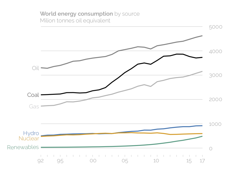
A line graph that shows the evolution of each energy source
Which clearly shows, among other messages, that:
- As opposed to oil, coal and natural gas, renewables consumption did not decrease in 2009 due to the financial crisis.
- Nuclear consumption has remained constant, and even decreased, in the last years.
- Oil energy consumption is larger than coal; however, not as much as in the nineties since coal consumption started to substantially grow around 2002.
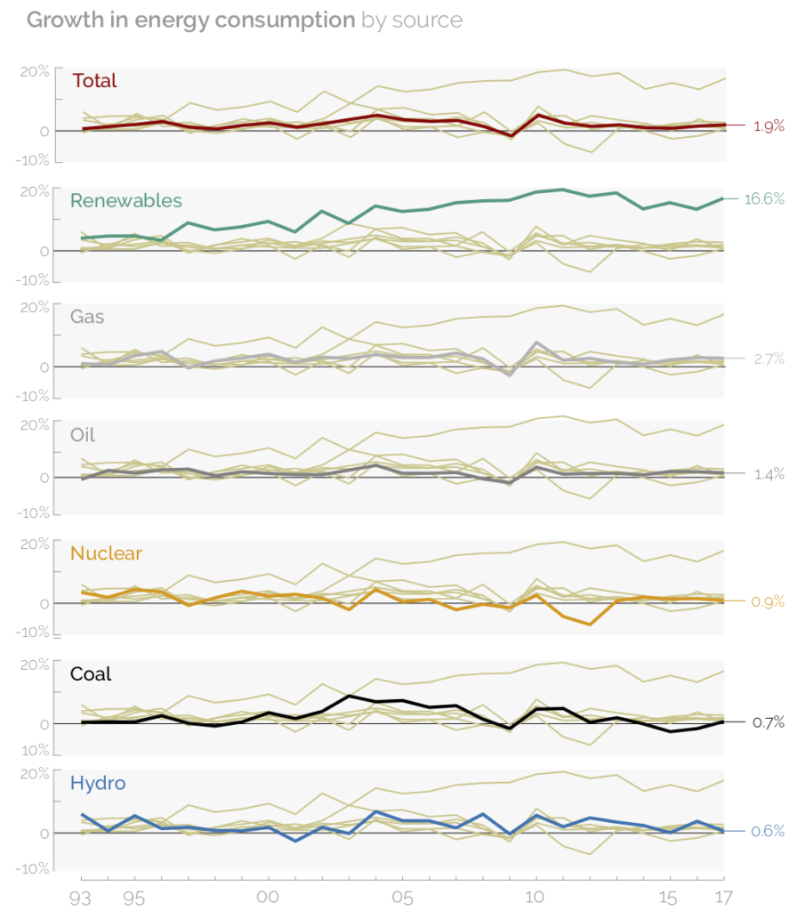
Small multiples to display and highlight the growth of each energy source
In order to display the growth rates of total world energy consumption and of consumption per energy source, we have utilised small multiples. The same plot is repeated seven times, each one of them highlighting one line. Total consumption is placed first; then, each energy source appears in descending order according to the growth rate in the last year. From this graph, it is clear that renewables are growing at substantially higher rates than the rest of energy sources. Although fossil fuels appear like increasing fast in the previous graph, their growth rates are not as high.
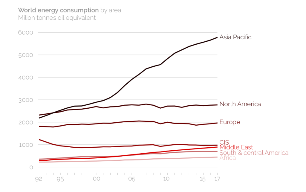
A line graph to compare energy consumption by geographical area
This line graph highlights the impressive growth on energy consumption in Asia Pacific since 2000, probably due to industrialisation in China. Its consumption almost doubles the one in North America. On the other hand, Europe has remained constant at around 2000 mote for the last 25 years.
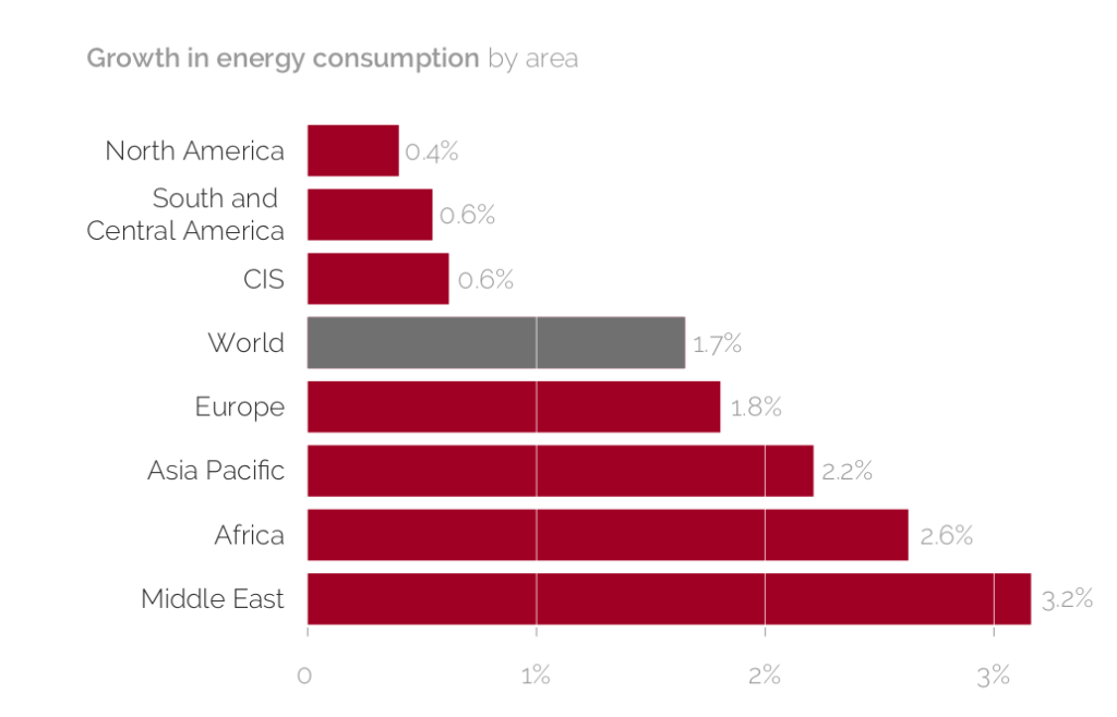
A bar chart comparing growth per region in the last year
A bar chart allows quickly comparing different categories of one variable. If plotted horizontally, we have enough space for writing down the categories without having to tilt them. Moreover, we’ve shown them in ascending order so that it’s immediately evident which region grew the most, which the least and which ones were below or above average.
When producing this graph, we actually realised an error in BP’s report. They write that “Growth was below average in Asia Pacific, the Middle East and S. & Cent. America but above average in other regions”; however, Asia Pacific, the Middle East, Africa and Europe grew all at above average rates.
Our take-away lesson: focus on the messages, don’t follow the default.
BP’s data is so rich that has allowed us to produce four different graphs (and we could go on plotting), all transmitting a different key message. By using the ‘default’ stacked area graph, so often seen in the energy scene, BP ended up making a mistake when reporting the growth by area. As we highlight in our graph training, our take-away lesson is: plot the data, focus on the message (adapt the graph to it) and never trust the defaults.