Did you know that one in twelve Caucasian (8%), one in 20 Asian (5%) and one in 25 African (4%) males are colourblind? For the case of women, the probability goes down to one in 200 (0.5%). Still, this means that there are always colourblind people among the readers and the audience of the reports, papers and presentations that you produce. In academia, assuming that your next journal paper is reviewed by three white males (which is rather likely given the population in science nowadays), the probability that at least one of them is colourblind is 22%.
Despite being a rather common condition, its causes and effects are unknown to many. For example, are you aware of the different types of colourblindness? How do colourblind people actually see? Most importantly, what can you do to ensure that your next graphs, presentations and reports can be well distinguished by everyone? Continue reading, we unveil all of these issues in this post.
What is colour blindness?
The human eye sees by stimulating the retina, which is composed of rods and cones. The rods, located in the peripheral retina, allow our night vision but are not good at distinguishing colours. Cones, located in the centre of the retina, enable us to perceive colour in daylight conditions.
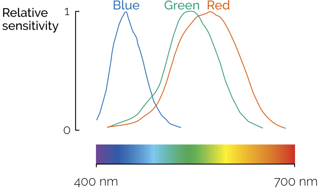
Visible colours correspond to light wavelengths ranging from 400 to 700 nm. In the retina, each one of the three types of cones that we have contains a light sensitive pigment over a range of wavelengths. The colours that we see depend on the sensitivity ranges of those pigments, which in a healthy eye peak at blue, green and red—depending on the type of cone.

Some people believe that colour blind sufferers see the world in black and white. This is a big misconception: monochromasy (total absence of colour sensation) is extremely rare. There are however several degrees of colour blindness, more correctly named colour vision deficiencies.
- Trichromasy: people with normal cones and light sensitive pigment can see all the different colours and delicate mixtures of them by using cones sensitive to one of three light wavelengths (red, green, and blue).
- Anomalous trichromasy: A mild colour deficiency occurs when a mutation causes one or more of the three cones light sensitive pigments to shift the peak sensitivity.
- Dichromasy: A more severe colour deficiency, when the function of one type of the cones cells is lost.
The type of affected cones also has a big impact on colour vision deficiency. As there are three different types of colour cone receptors, there are also three different main forms: red (protan), green (deutan), and blue (tritan) disorders. Since red and green deficiency result in quite similar colour vision problems, they are often grouped together and known as red-green colour blindness. Blue colour deficiency is rare, with an occurrence as low as 0.001 %.

How do people suffering from colour vision deficiency see?
People with dichromatic colour vision have only two types of cones capable of perceiving colours. Those with anomalous trichromatic vision may have almost normal colour perception to almost total absence of perception of the ‘faulty’ colour.
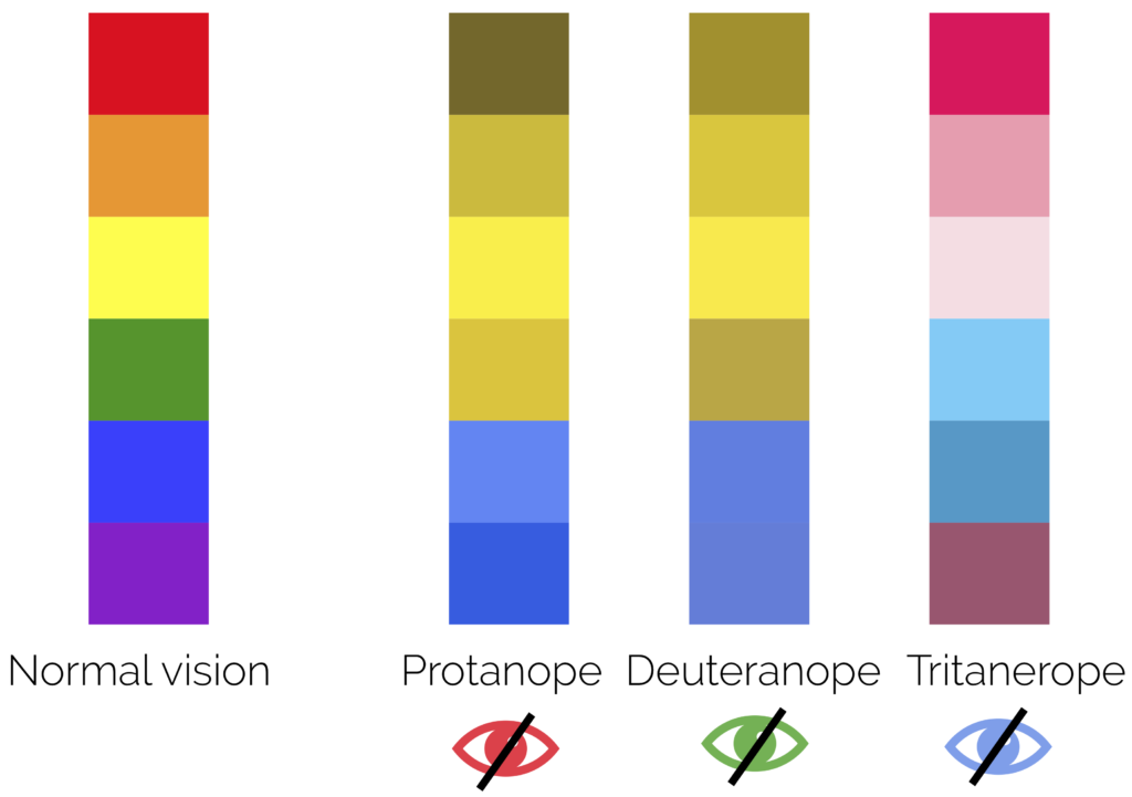
People with both red and green deficiencies live in a world of murky greens where blues and yellows stand out. Browns, oranges, reds and greens are easily confused. Also blues with purples. Both types will struggle to identify pale shades of most colours.
People with reduced blue sensitivity have difficulties differencing blue and yellow, violet and red and blue and green. Their world appears as generally red, pink, black, white, grey and turquoise.

How can you produce graphs, presentations and reports that everyone can interpret?

- Don’t use legends, label your graphs instead. We advocate against legends in any case as they force reading graphs in two steps. With labels, the graph can be read in only one step and people with colour vision deficiency are not misguided.
- Avoid dark red, magenta or thin lines over black or dark blue background. This includes red chalk on blackboards. Although red is a vivid colour for non-colourblind people, it appears as dark green for protanopes . Same applies to highlighting dark red characters in black text.
- People with colour vision deficiencies find it difficult to tell the name of colours (when for example referring to graph items in a text). Recognising colour differences and identifying colour names are radically different tasks.
- Thicker, rather than thinner lines make it easier to distinguish colours. For colour-coded text, bold sans serif fonts (Arial or Helvetica instead of Times) work better.
- Avoid conveying important information in the form of colour and reduce the number of colours used in graphs. Black and shades of grey are usually underestimated.
- Use vivid rather than pale colours. Highlight contrast not only with colours but also with brightness.
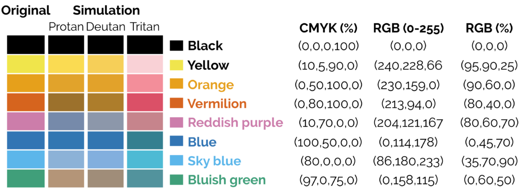
Once all the previous comments have been taken into consideration, the following palette of colours is suggested as being unambiguous to both colour and non-colourblinds:

- Instead of red, vermillion can also be distinguished by protanopes.
- Colours between yellow and green are prevented as they can be indistinguishable from yellow and orange.
- Instead of green, bluish green can be differentiated from red/brown.
- Instead of violet, reddish purple contrasts better with blue.
When combining colours from this palette:
- Use “warm” and “cool” colours alternatively.
- When using two warm colours or two cool colours, use noticeable differences in brightness or saturation.
- Refrain from using colour combinations with low saturation or low brightness.
Any questions, comments or suggestions? Please let us know in the comments or contact us.
Sources:
ColorVisionTesting – What is Colorblindness and the different types?
Colorblindor: Color blind essentials


Interesting article. Thanks for sharing. With https://coolors.co/, you have a “Color Blindness” option to see how color palettes are seen differently. Best regards
Hi Lucio,
Thanks for the “cool” website link, this is really interesting to generate the colour palettes automatically!
Best regards,
Francesco
Hi Francesco,
This is indeed interesting and very useful: we can imagine how could it be difficult to analyze a graph if all the colors would be similar.
Not only can we imagine the issue, but also experience it. There are nice websites where we can simply upload a picture and apply a color filter. This would also be a solution to check that a graph is colourblind-friendly,
Some exemples:
https://www.toptal.com/designers/colorfilter/
https://www.color-blindness.com/coblis-color-blindness-simulator/
I personally found the second website convenient. The first may be a good solution if some people want to test the colors on a webpage they created on their own.
Best regards,
Steven
Thanks Steven. Very useful ressources!
Hi Steven,
Happy that you liked the post!
Many thanks for the links, they are indeed very useful to check each one’s own work. We’ll include them in our graph and presentations trainings.
Best wishes,
Marina
Another issue related to colour deficiency: when giving a presentation, if possible avoid using a red laser pointer. These are nearly invisible to people with protanomaly (me) or protanopia. Instead, use a green laser or a stick.
Hi Bruce,
Thanks a lot for your comment! Indeed a stick or even better the presenter directly pointing to the screen is always preferable than a laser pointer. This serves both to include colourblind people in the presentation and to ensure that the attention of the audience keeps focused on the presenter.
All the best!
Very useful info, especially for web app designers who sometimes forget their audience.
One credit card company tried to discourage monthly paper statements by charging $3 for that privilege. However, one look at their online statement and it was obvious that they were also trying to fatten the bottom lines of black ink makers. Most of their billing statement was black backgrojnd with white lettering.
Anyone printing their monthly statement on a home printer would be wasting a lot of black ink to save a paper record.